The Golden Ratio of Gameplay: An Aesthetic Analysis of Vintage Board Game Design
There’s a certain magic to opening a vintage board game box, isn't there? It's not just the potential for an evening of laughter and friendly competition; it's the palpable sense of history held within. The scent of aged cardboard, the delicate crackle of the box, the faded artwork – these aren't mere relics; they're echoes of a bygone era, miniature worlds meticulously crafted to entertain and delight. As collectors, we often focus on rarity and value, but I believe there's a deeper appreciation to be gained by examining these games through the lens of art and design. Let's explore the golden ratio of gameplay, examining how principles of aesthetics created experiences that were, and continue to be, profoundly captivating.
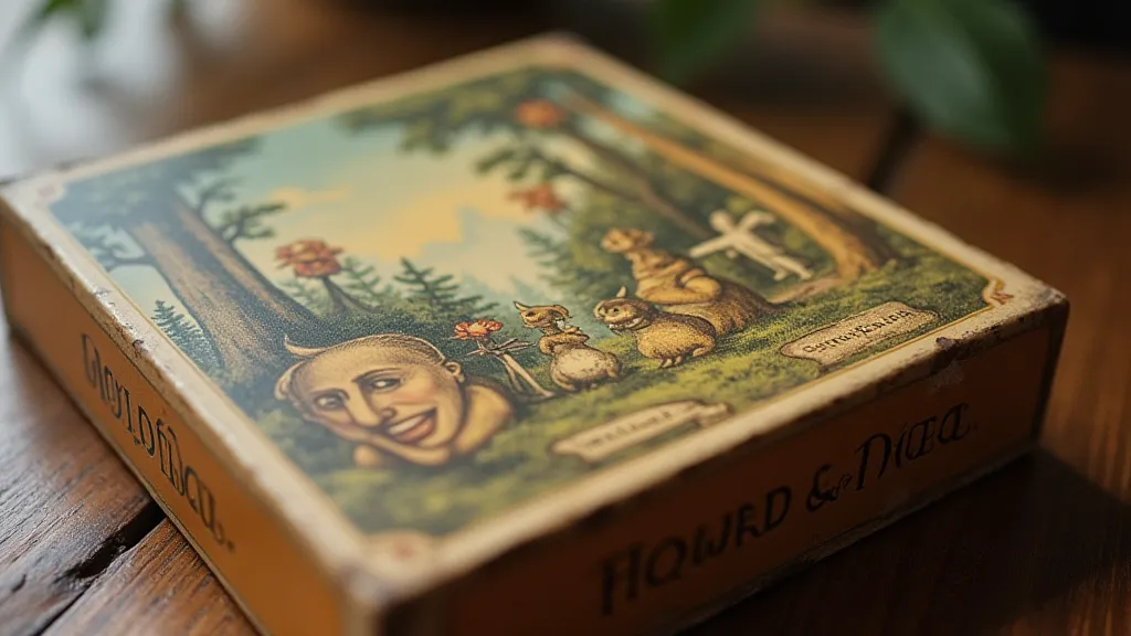
My own fascination began with a partially disassembled copy of “The Mansion of Happiness,” a 19th-century game that prefigures Monopoly in many ways. Found at a dusty antique shop, it wasn’t the potential value that drew me in, but the faded grandeur of the artwork. The intricate line drawings, the carefully chosen color palette (what little remained!), the slightly chaotic but inherently pleasing layout – it felt like uncovering a forgotten secret. That initial spark ignited a journey of discovery, not just of games themselves, but of the artistic sensibilities that shaped them.
The Evolution of Visual Appeal: From Moral Instruction to Family Entertainment
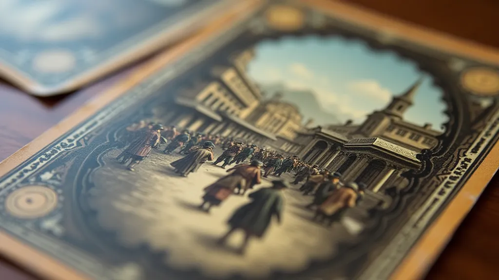
Early board games, particularly in the 18th and 19th centuries, weren’t solely intended for entertainment. Many served as moral instruction tools, designed to teach children (and adults) virtues like honesty, diligence, and piety. “The Mansion of Happiness,” for example, uses a spiral track to represent the path to moral perfection, rewarding virtuous behavior and penalizing vice. The artwork reflects this didactic purpose – often featuring solemn portraits of virtuous figures and cautionary illustrations depicting undesirable behaviors. The visual style tended towards realism, aiming to portray a believable world of consequences. The careful selection of imagery wasn't merely decorative; it was a deliberate attempt to influence behavior and reinforce societal norms.
As the 20th century dawned, the tone shifted. Board games became less about moral lectures and more about family fun. This change is vividly reflected in the design. Artists began to embrace more stylized and fantastical imagery. The use of color exploded, moving beyond the limited palettes of earlier games to incorporate vibrant hues and playful combinations. Typography also evolved, transitioning from formal, serif fonts to bolder, more accessible typefaces that would catch the eye and convey a sense of excitement. These shifts weren’t random occurrences; they mirrored broader societal changes – a move away from Victorian austerity and towards a more optimistic and consumer-driven culture.
The Golden Ratio in Layout and Composition
While not always consciously applied, the principles of the golden ratio – often expressed as roughly 1:1.618 – can be observed in the composition of vintage board games. This ratio, found throughout nature and frequently employed by artists throughout history, creates a sense of balance and harmony. Look at the layout of a classic Parker Brothers Monopoly board, for instance. The placement of properties, railroads, and utilities often adheres to a visual rhythm that is inherently pleasing. The layout directs your eye around the board, creating a dynamic flow and contributing to the overall feeling of order and predictability (despite the chaotic nature of the gameplay itself). You can see similar aesthetic choices applied across various games; the deliberate composition wasn’t accidental, but a calculated approach to create visual harmony.
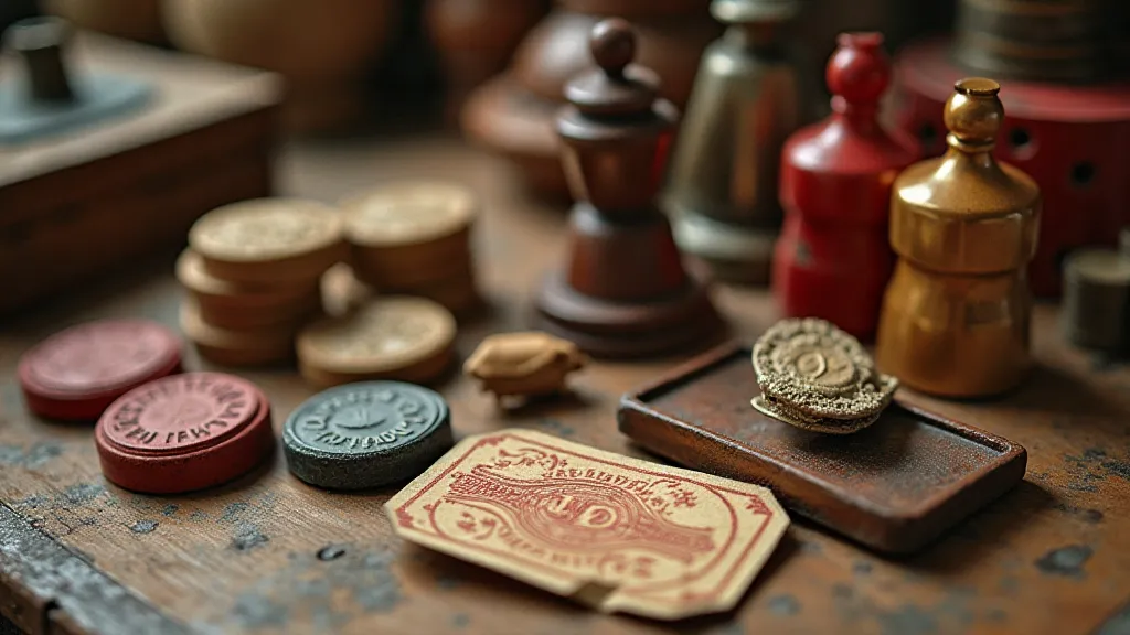
Beyond the overall board layout, individual game components – cards, dice, tokens – also benefit from thoughtful design. Consider the art deco styling of 1930s games like “Flinn’s Travel Game.” The geometric patterns, the stylized figures, the use of contrasting colors – these elements combine to create a visually arresting experience. Even the humble game die, often overlooked, can be a testament to craftsmanship and artistic flair. Some antique dice feature intricate engravings or are crafted from unusual materials, adding a touch of elegance to the gameplay. The creators understood that even the smallest elements contributed to the overall aesthetic.
Color Palettes and the Power of Nostalgia
The color palettes used in vintage board games are particularly evocative of their time. Early games frequently employed muted tones – browns, greens, yellows – reflecting the limited availability of pigments. As printing technology advanced, brighter and more diverse colors became accessible, and artists began to experiment with bolder combinations. The use of reds, blues, and yellows in games from the 1950s and 1960s instantly conjures a sense of mid-century optimism and vibrancy. The color choices weren't arbitrary; they were intimately connected to the social and technological context of the era. Examining these palettes allows us to understand not just the aesthetics of the games, but also the broader cultural climate in which they were created. Often, the perceived vibrancy of these colors, even compared to modern standards, speaks volumes about the evolution of visual culture. The nuances in these palettes, and how they reflect a shifting understanding of color itself, can be explored further in articles such as Chromatic Ghosts: The Lost Art of Board Game Illustration.
It's important to note that color perception also changes over time. What might have seemed vibrant and exciting in the 1950s might appear somewhat subdued to our modern eyes, accustomed to the saturated colors of digital media. However, this difference in perception doesn't diminish the artistic merit of the original design. Instead, it provides a fascinating insight into the evolution of visual aesthetics.
The Silent History of Manufacturing
Beyond the artistic design, the history of board game manufacturing itself is a fascinating topic. Many regional manufacturers quietly produced games that reflected local culture and sensibilities. Understanding these often-overlooked businesses sheds light on the broader industrial landscape of the time. The legacy of these regional manufacturers, and their contributions to the world of board games, can be explored more deeply in The Silent Sentinels: Preserving the Legacy of Regional Board Game Manufacturers. Their stories are often intertwined with the very materials used – the cardboard, the inks, and the pigments that give these games their character.
The Art of Restoration & Preservation
Preserving these beautiful artifacts is, of course, paramount. However, restoration should be approached with a delicate touch. The goal isn't to make the game look "new," but to stabilize its condition and protect its historical integrity. Excessive cleaning or repainting can erase the unique character and patina that make these games so special. Gentle cleaning with archival-quality materials and careful repair of damaged components are often the best approaches. It's a process that requires a deep understanding of the materials and techniques used in the game's construction.
Understanding the materials used in the game's construction – the type of cardboard, the inks used for printing, the pigments used for coloring – is crucial for effective preservation. This knowledge not only informs restoration efforts but also provides a deeper appreciation for the craftsmanship involved in creating these games.
More Than Just a Game: A Window to the Past
Collecting vintage board games is more than just acquiring objects; it’s about collecting memories, stories, and a tangible connection to the past. Each game is a window into a different era, reflecting the values, aesthetics, and cultural trends of its time. The games often served as vehicles for transmitting cultural values across generations. The impact of these seemingly simple games on family dynamics and the intergenerational transfer of traditions is considerable. For families who have cherished these games across decades, the collection itself becomes a testament to a shared history. The accumulation of these games and the stories attached to them become a precious inheritance, as discussed in The Weight of Inheritance: Family Board Game Collections Across Generations. They act as physical embodiments of a family's history and values.
The design choices – from the layout of the board to the illustrations on the cards – are all imbued with meaning, reflecting the social, political, and economic context of the time. Even the rules of the game itself can offer insights into the prevailing attitudes and beliefs of the era. Examining these aspects provides a broader understanding of the history that shaped them, and we ensure that these captivating relics continue to inspire and entertain for generations to come.
The games often mirrored societal tensions and anxieties, albeit in a subtle and often symbolic way. Understanding the historical context is key to deciphering these hidden messages and appreciating the full complexity of the design. The world of board games, when examined closely, reveals a surprisingly detailed reflection of the culture that created it. The depiction of conflict, strategy, and competition within these games also offer a lens through which to understand the prevailing attitudes towards these concepts in different eras.
The next time you open a vintage board game box, take a moment to appreciate not just the potential for gameplay, but the artistry and design that have endured the test of time. It's a journey of discovery, a connection to the past, and a celebration of the enduring power of play.